
Tags
The PEEL Method
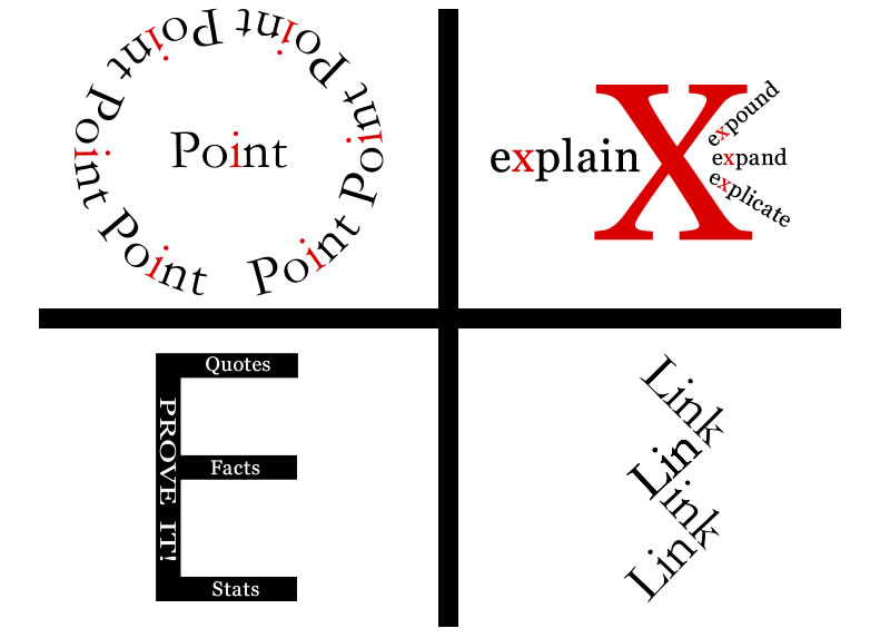
The PEEL Method: Point, Explain, Evidence & Link
After reading Lohr’s Chapter 9, I focused on three specific areas when designing each of the four key words for my instructional unit. These areas are readability, presentation, and experimentation.
Readability is the most important aspect of design especially when it comes to selecting and utilizing typefaces for instruction. Obviously clear and readable typefaces support learning. Choosing a particular typeface based on use (heading versus body) is essential. Lohr states that both Georgia and Garamond are very readable classic typefaces (p. 230). Even though Georgia has been specifically designed for electronic viewing (p. 233) both texts seem to work well on paper and on screen. For instance, I used Georgia with the Point graphic and Garamond with the Link graphic. When I stood six feet back from the computer screen (p. 240), as Lohr recommends, both were equally readable. What is interesting though is I tended to rely on the Georgia typeface more than the rest, especially when more written text was required (please refer to Explain and Evidence graphics). Perhaps that is why typography is both an art and a science (p. 226).
Although readability is very important, how a typeface is presented (arranged) also reinforces learning and enhances meaning at the same time. Both the Point and Link graphics were arranged to emphasize the meaning of each word as well as the concept (as it applies to essay writing) associated with each word. The Point graphic relies on repetition of the word point as well as the red i’s because I wanted the graphic to mimic gun sights thereby symbolizing the idea that the point of the essay must be narrowed down, focused and specific. Again, the repetitious use of the word link and the actual linking of each word reinforces the idea that each paragraph must link back to the controlling idea. The Link graphic also supports why transitions or transitional phrases are so important in essay writing. Repetition and arrangement are also utilized in the Explain graphic. Because the word explain sounds like it starts with an x, the x imagery became essential to the design. All of the other words (expound, expand, explicate) included in the graphic also repeat the x sound while reinforcing the meaning of the word explain at the same time. Furthermore, the x imagery is repeated in terms of use and colour to stress the importance of the x which represents the word explain. The inclusion of more words in the graphic also reinforces the fact that a writer must use significantly more words to explain the point being made.
Like readability and presentation, experimentation affects both design and instructional choices. Lohr recommends that designers and instructors experiment with typography because the “it depends rule” must apply and a “cookbook approach” does not work (p. 226). Sometimes you simply have to experiment to see whether the choice in typeface or arrangement works effectively or not. For example I had to select a totally different typeface for the E in the Evidence graphic. I required a typeface that allowed me to superimpose words on top of the letter itself. Neither the Georgia nor Garamond typefaces were wide enough to superimpose words on top of the typeface’s letters. In the end I selected a Century Gothic typeface for the E. This typeface was not only readable but supported both the design and instructional purposes I preferred. The Evidence graphic was the most challenging to design. I found it difficult to express its meaning visually; therefore, I decided to use key words like quotes, facts, and stats to support its instructional message. Furthermore, although Lohr discussed that x-height made reading easier for children (p. 250) I soon realized that the phrase PROVE IT! had to be capitalized. I experimented with lower case letters, different typefaces, kearning and/or spacing—and in the end capitalizing the words worked best—especially when looking at the computer screen from a distance or holding a piece paper out at arm’s length. Although the words quotes, facts and stats are important the phrase PROVE IT is also significant because evidence must be incorporated to support one’s point (argument) in essay writing and that is why I used capital letters and a larger font size here.
As you can see readability, presentation and experimentation are extremely important when it comes to design and instructional purposes. Completing this assignment has definitely encouraged me to be more mindful of my choices in graphics, both as a designer and an educator.
References
Lohr, L. (2008). Creating graphics for learning and performance: Lessons in visual literacy (2nd ed.). Upper Saddle River, N.J: Pearson Education, Inc.
