Tags
Working with Whitespace

Thesis Statement Formula

Essay Structure Formula 2

Thesis Statement Formula
Thesis Statement Formula 2
Why Formulas?
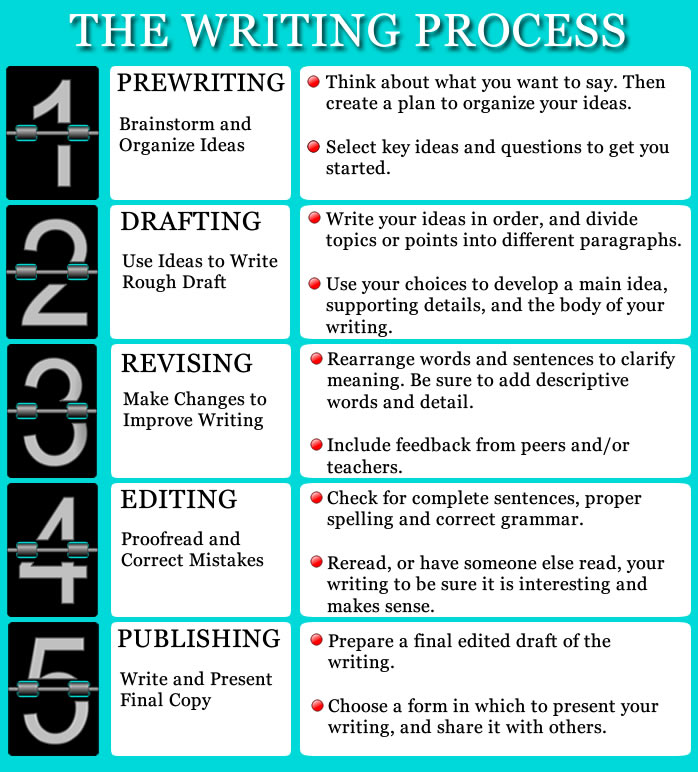
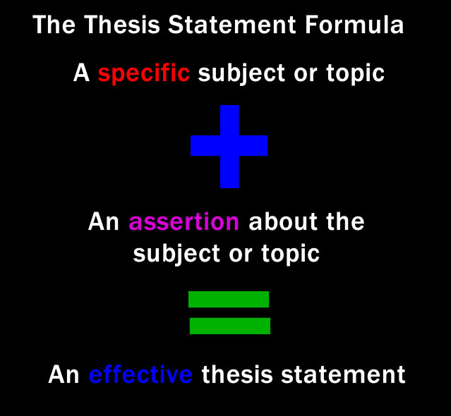
Based on the needs of ELA10-2 students both formulas should fulfill the following three components: 1) conciseness, 2) chunking of information, and 3) support prior learning. ELA10-2 students are more likely to achieve success if information is concise. These two formulas provide important information in a straightforward and simple manner. This makes them easy to use. Furthermore, the information provided is chunked in such a way that it should make the information easy to learn as well. Both formulas focus on three or less concepts, meaning both are well under the 7 plus or minus 2 rule mentioned in the previous module. Furthermore, each formula also reinforces prior learning. For instance, the essay structure formula reinforces the relationship between writer and reader just like the thesis analogy does. Secondly, it also supports the keyhole model as it indicates the function of each part of the essay (introduction, body, and conclusion). The second formula on thesis statements supports the thesis analogy as well as the opening activity in the unit because it emphasizes not only what a thesis statement is but why it is so important.
Goal(s)
According to Hartley, space—if used correctly—should make it easier to access relevant pieces of information (Lohr, p. 274). Because of the nature of ELA10-2 students I wanted relevant information to be easy to access, so I simplified the wording and manipulated the whitespace to make the important content easy to read. The tricky part here is this: how do you truly know if you have the right amount of whitespace to support the learning. I hope I have made the information easier to access. Obviously using other design principles like alignment or symmetry and avoiding trapped space help but I still uncertain as to whether I have achieved this goal or not when just considering whitespace.
A second goal was to “create a balance between whitespace and other elements in the visuals” (Lohr, p. 275). This goal seemed harder to achieve than the first. If you look at the Essay Structure Formula, you can see that the content on the right hand side contains sentences that are not the same length. This means one side of the formula seems unbalanced. In the first example, I balanced the whitespace on the left hand side by using the same amount of space between each phrase (eg. Intro/Thesis and Body). However, the other side is not balanced in terms of space between phrases or sentences. Equilibrium seems hard to achieve when text is different lengths. The second example (which uses black whitespace) reverses the balance, making the right side balanced and the left side unbalanced. Which is better and why? This questioning makes a designer wonder how much time one should spend “contemplating” this issue and its impact on learning.
Comparison-Contrast & User-Tests
Although whitespace is whitespace no matter what colour you use (Lohr, p. 273), more testers seemed drawn to a black background (especially with the first formula). Most thought other colours stood out more and made the material easier to read. Ironically one user said the black graphic seemed to be more forgiving when it came to large areas of whitespace. For example, one user noted that the word Body in the first formula seemed to have less space around it when black was used as the background colour. Yet the space is the same size in both exemplars. I also tried aligning everything to the left in the Parts of an Essay section to lessen the whitespace around the word Body … then the arrows looked strange (whether the same size or not). Users preferred a smaller and narrower arrow; so I did keep the sleeker same-sized arrows in the end, mostly because the whitespace seemed to achieve equilibrium with a sleeker arrow (p. 275).
The second formula (Thesis Statements) divided users more than the first one. I left both exemplars identical except for the background colour. Some preferred the white background while others preferred the black one. I have to admit I like the white background more so but I cannot defend my choice when it comes to the issue of whitespace. Because of the division between users, it made me consider the following question: How much does personal preference (re: colours) affect learning? [I haven’t come to a conclusion yet.]
Most users thought this formula was balanced no matter the background colour. One noted the connection between the blue cross and the word effective, which made my day. Early on in the testing phase, the first user recommended that I enlarge the text font and make the symbols smaller because his eyes went to the symbols first and therefore they detracted from the relevant text. That was good advice. None of the other users said that the symbols were a distraction after I made the change.
References
Lohr, L. (2008). Creating graphics for learning and performance: Lessons in visual literacy (2nd ed.). Upper Saddle River, N.J: Pearson Education, Inc.